Design Review of iPhone Event Countdown Apps [2020, iOS Apps]
6 min read
|Published 8/2/2020
I have a big event coming up at the end of September, and given gestures around, indicates the Year of ~2020~, I’m looking for something to help me count down towards the event.
I’ve heard of countdown apps before, but never used them. In the past I’ve been a fan of googling “days till 25th December”. Time to change that and try some different Countdown apps out, and review their design (user experience and user interface visual design) in the process!
Exploring Options
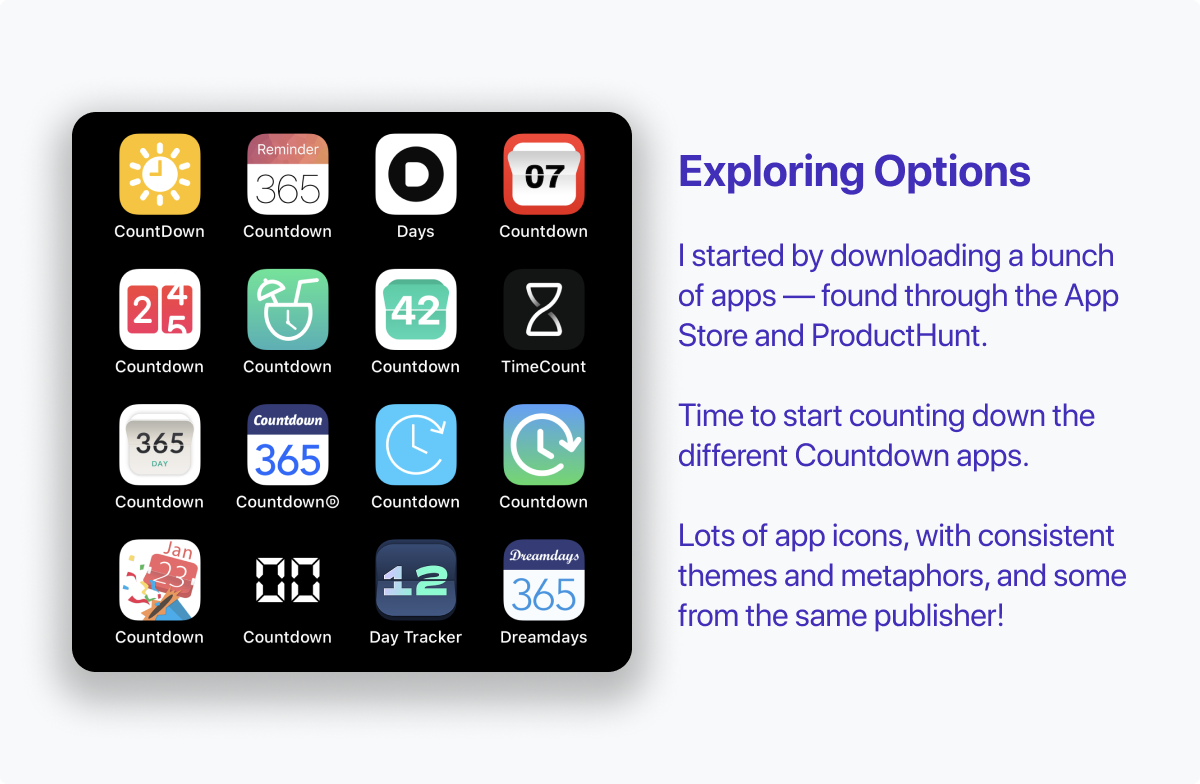
I started by downloading sixteen different countdown apps. These were found in several different ways — some directly from the App Store search (Event Countdown App), some from looking at ProductHunt.
Straight away there were a lot of similarities in name, app icon and general design, with some apps even being from the same publisher with minor differences.
 \
\
Something that stood out early was that some of the apps I downloaded were quite new and polished, while visually looked directly out of 2015. Some used base iOS components, and one even had a Material UI style design.
Some Apps Dropped out of the Race Early On
In order to get a fair test of the apps, I created one event in each app. This gave a good sense of visual design (super important if you are checking your exciting upcoming event countdown daily!), how easy it was to create new events, and what ads might be part of the app.
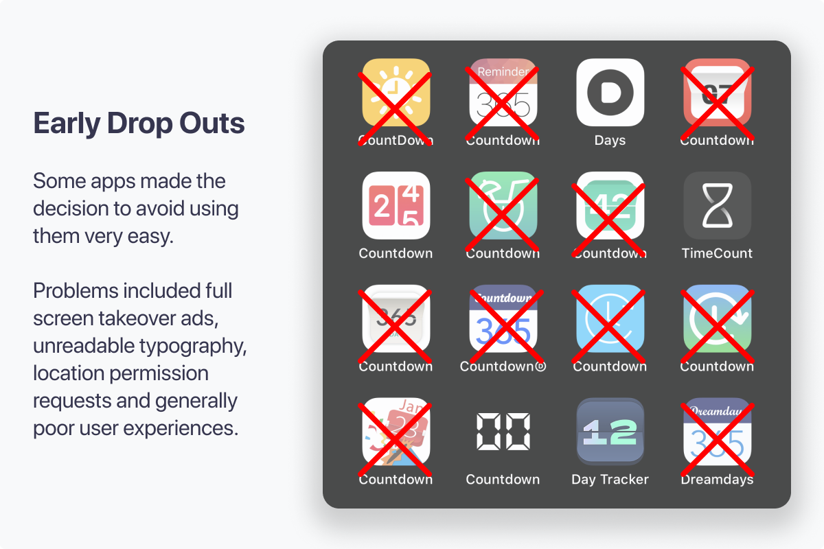
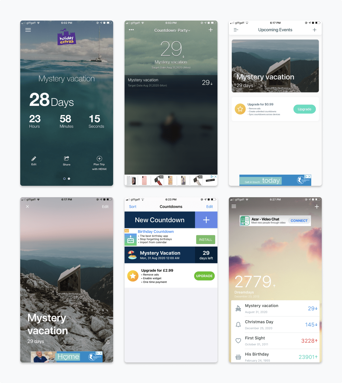
While in general I am in favour of ads in iPhone apps — and I realise there’s big problems with the business model of smaller indie apps, several of these apps were completely abusive and unusable. Full screen takeover ads every 60-seconds for Tinder, tourism, and health insurance are dealbreakers!
A selection of screenshots that immediately stood out with poor experiences. The most significant problems related to typography, confusing layouts, and hostile ads that took over the screen or popped up on every second screen tap.
Narrowing the Options
After initial exploration in each app, the remaining five stood out as being worth exploring. Each had a slightly different design style — ranging from wide, modern typography to utilitarian monotype and traditional photo with text, done well.
Let’s break down pros and cons.
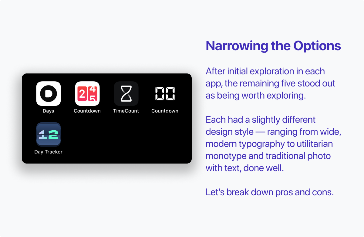
The Five Remaining Options
- Days
- Countdown (2 4/5 App Icon)
- TimeCount
- Countdown (00 App Icon)
- Day Tracker
Days
Days • Event Countdown - iOS App Store Link
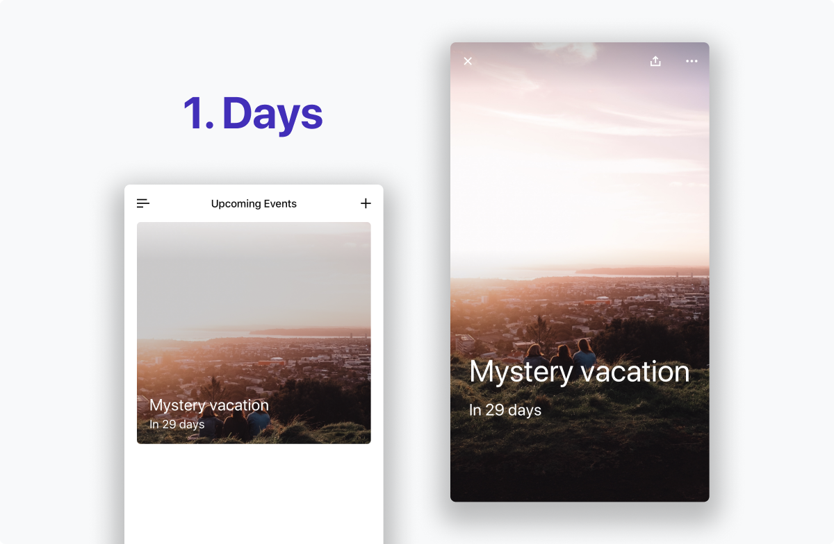
Pros
- Lovely display list of upcoming events
- Tap on each individual event to see a full screen of your chosen image and countdown
- Focused, clear layout that highlights exactly what you need when you want it
- No ads, one time £1.99 purchase to upgrade for full features.
Cons
- No text customisation — only one option for colour and placement
Countdown (2 4/5 App Icon)
Countdown – Count Down To Date - iOS App Store Link
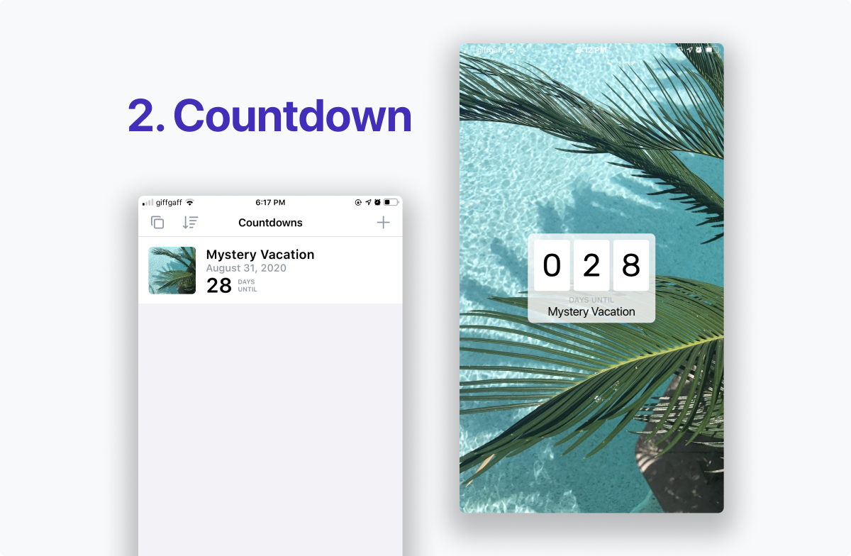
Pros
- Text can be toggled between white and black options, giving more flexibility for different pictures
- A simple, focused list view of Countdowns with a mix of sorting options
- No intrusive ads. The top left icon on the list view links to More Apps by the publisher — a calm, out of the way advertisement.
Cons
- Navigation from the full screen event view towards the main list is awkward, and it can be difficult to see the icon in the top left. No gesture navigation options.
TimeCount
TimeCount - Day Counter - iOS App Store Link
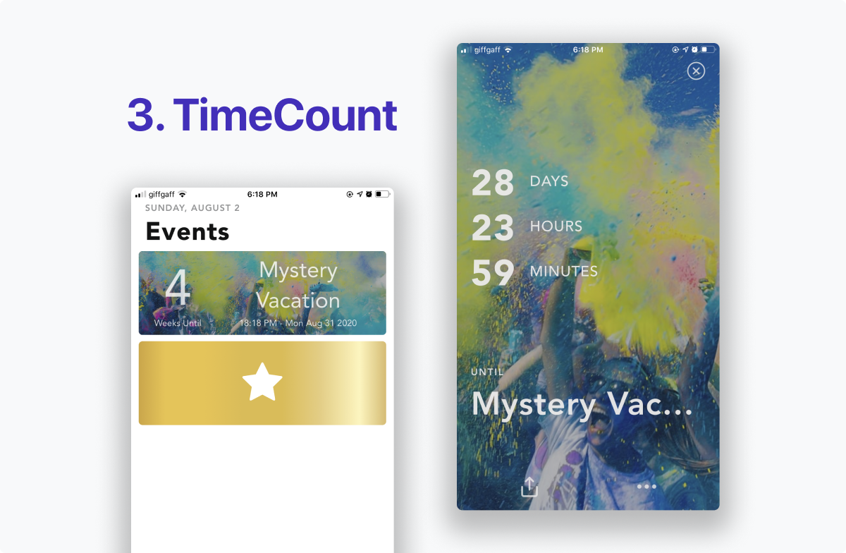
Pros
- A bold, large and clear display of future Events.
- A nice new event experience that offers background images from Unsplash or your personal camera roll. Flexible options for countdown time unit, display image brightness and notification event (send a message to your future self!)
- A wide variety of useful premium features — Automatic themes, customisable Layouts, Size options, new event layouts.
Cons
- The Premium upgrade is a subscription of £8.99 per year or £0.99 per month. While subscriptions support ongoing development, this isn’t the type of app I would normally subscribe towards!
Countdown (00 App Icon)
Simple Event Countdown Timer - iOS App Store Link
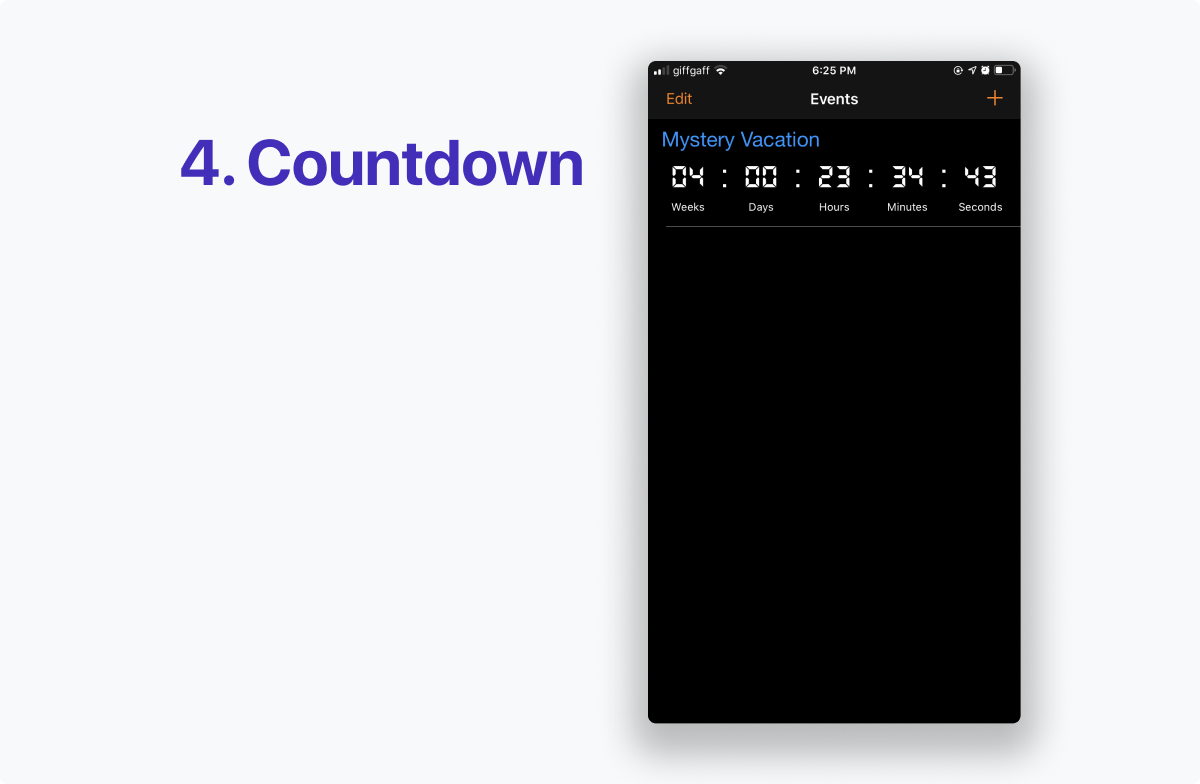
Pros
- A direct, single screen interface. View upcoming events, add new events, move position and change details all with in the same screen.
- No ads! A simple, focused app.
- With the single list view and the simplest ‘add new event' feature, this app seems ideal for regular week-week event countdowns.
Cons
- No images, no text customisation, no frills. Good, and bad depending on your use case.
Day Tracker
Day Counter. Count Up & Down - iOS App Store Link
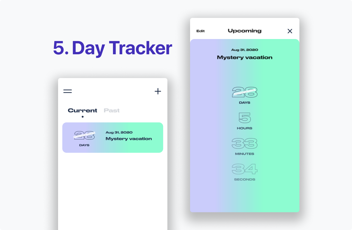
Pros
- A bold, bright and lovely visual identity. This app really stands out from the crowd.
- An easily accessibly Past Events list to see Current and Future events. Look forward to new memories, and reminisce on old ones!
- Count Up and Count Down features offer a good level of flexibility.
Cons
- While the bright, bold visual identity is lovely, it won’t fit every upcoming event. While it may work for an upcoming rave party, it wouldn’t more somber events. The lack of customisation hurts this overall.
Final Recommendation: Days App
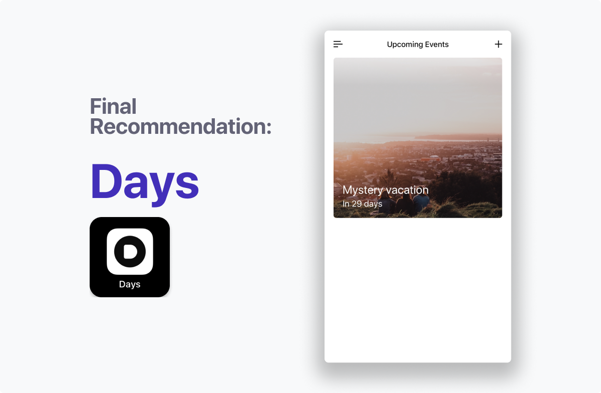
After considering 16 options, creating 16 Mysterious Vacation events and reviewing a whole lot of great apps, and some not-so-great apps, my final recommendation is the Days app.
The Days Countdown App offers a great mix of flexibility, clean and focused design, free features and reasonable upgrades. It does exactly what I want — and I’m sure is the best iPhone (iOS) Countdown App for most people in 2020.
Now it’s time to go pay my £2 (2 pound) upgrade cost and add in my big September event!